day06-Flex布局
目标:熟练使用 Flex 完成结构化布局
01-标准流
标准流也叫文档流,指的是标签在页面中默认的排布规则,例如:块元素独占一行,行内元素可以一行显示多个。
02-浮动
基本使用
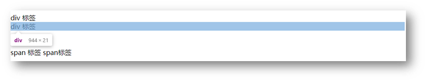
作用:让块元素水平排列。
属性名:float
属性值
1
2
3
4
5
6
7
8
9
10
11
12
13
14
15
16
17
18
19
20
21
22
23
| <style>
.one {
width: 100px;
height: 100px;
background-color: brown;
float: left;
}
.two {
width: 200px;
height: 200px;
background-color: orange;
float: right;
}
</style>
<div class="one">one</div>
<div class="two">two</div>
|
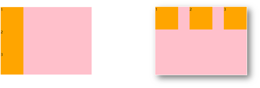
特点:
- 浮动后的盒子顶对齐
- 浮动后的盒子具备行内块特点
- 浮动后的盒子脱标,不占用标准流的位置
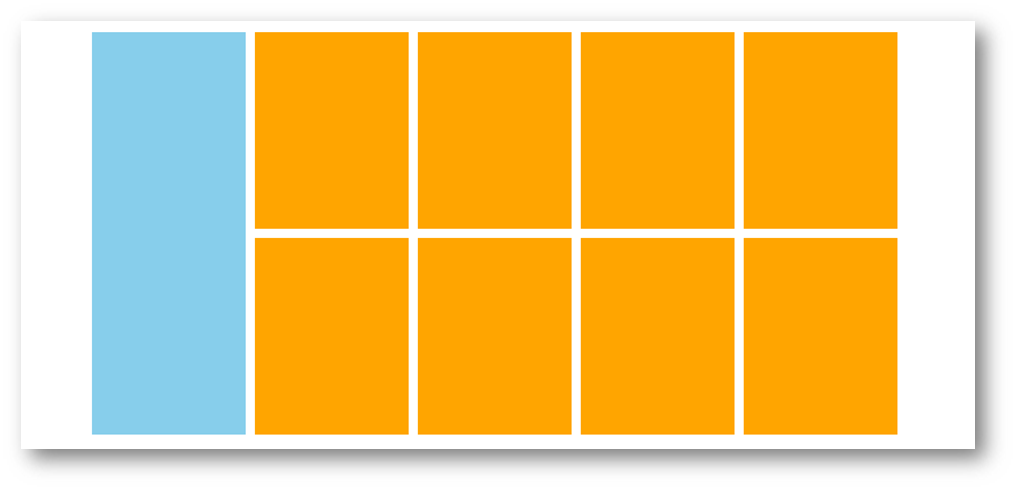
产品区域布局
HTML标签
1
2
3
4
5
6
7
8
9
10
11
12
13
14
15
16
|
<div class="product">
<div class="left"></div>
<div class="right">
<ul>
<li></li>
<li></li>
<li></li>
<li></li>
<li></li>
<li></li>
<li></li>
<li></li>
</ul>
</div>
</div>
|
CSS样式
1
2
3
4
5
6
7
8
9
10
11
12
13
14
15
16
17
18
19
20
21
22
23
24
25
26
27
28
29
30
31
32
33
34
35
36
37
38
39
40
41
42
43
44
45
46
47
| <style>
* {
margin: 0;
padding: 0;
}
li {
list-style: none;
}
.product {
margin: 50px auto;
width: 1226px;
height: 628px;
background-color: pink;
}
.left {
float: left;
width: 234px;
height: 628px;
background-color: skyblue;
}
.right {
float: right;
width: 978px;
height: 628px;
background-color: brown;
}
.right li {
float: left;
margin-right: 14px;
margin-bottom: 14px;
width: 234px;
height: 300px;
background-color: orange;
}
.right li:nth-child(4n) {
margin-right: 0;
}
</style>
|
清除浮动
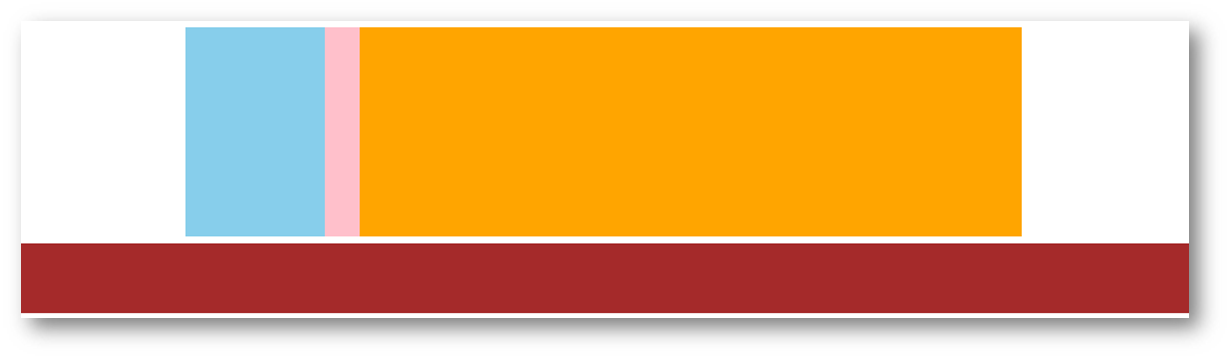
场景:浮动元素会脱标,如果父级没有高度,子级无法撑开父级高度(可能导致页面布局错乱)
解决方法:清除浮动(清除浮动带来的影响)
场景搭建
1
2
3
4
5
6
7
8
9
10
11
12
13
14
15
16
17
18
19
20
21
22
23
24
25
26
27
28
29
30
31
32
33
34
| <style>
.top {
margin: 10px auto;
width: 1200px;
background-color: pink;
}
.left {
float: left;
width: 200px;
height: 300px;
background-color: skyblue;
}
.right {
float: right;
width: 950px;
height: 300px;
background-color: orange;
}
.bottom {
height: 100px;
background-color: brown;
}
</style>
<div class="top">
<div class="left"></div>
<div class="right"></div>
</div>
<div class="bottom"></div>
|
方法一:额外标签法
在父元素内容的最后添加一个块级元素,设置 CSS 属性 clear: both
1
2
3
4
5
6
7
8
9
10
11
| <style>
.clearfix {
clear: both;
}
</style>
<div class="father">
<div class="left"></div>
<div class="right"></div>
<div class="clearfix"></div>
</div>
|
方法二:单伪元素法
- 准备 after 伪元素
1
2
3
4
5
| .clearfix::after {
content: "";
display: block;
clear: both;
}
|
- 父级使用 clearfix 类
1
| <div class="father clearfix"></div>
|
方法三:双伪元素法
- 准备 after 和 before 伪元素
1
2
3
4
5
6
7
8
9
10
11
12
|
.clearfix::before,
.clearfix::after {
content: "";
display: table;
}
.clearfix::after {
clear: both;
}
|
- 父级使用 clearfix 类
1
| <div class="father clearfix"></div>
|
方法四:overfow法
1
2
3
4
5
6
7
8
| .father {
margin: 10px auto;
width: 1200px;
background-color: pink;
overflow: hidden;
}
|
03-Flex布局
Flex 布局也叫弹性布局,是浏览器提倡的布局模型,非常适合结构化布局,提供了强大的空间分布和对齐能力。
Flex 模型不会产生浮动布局中脱标现象,布局网页更简单、更灵活。
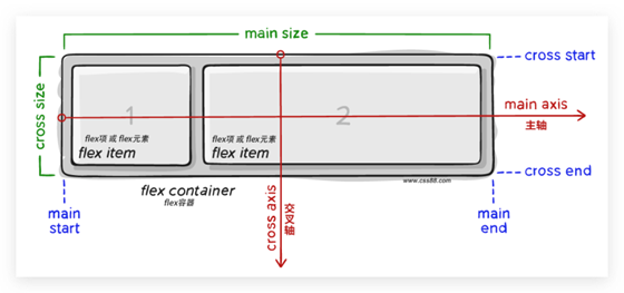
Flex组成
设置方式:给父元素设置 display: flex,子元素可以自动挤压或拉伸
组成部分:
- 弹性容器
- 弹性盒子
- 主轴:默认在水平方向
- 侧轴 / 交叉轴:默认在垂直方向
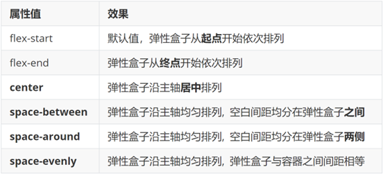
主轴对齐方式
属性名:justify-content

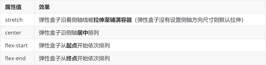
侧轴对齐方式
- align-items:当前弹性容器内所有弹性盒子的侧轴对齐方式(给弹性容器设置)
- align-self:单独控制某个弹性盒子的侧轴对齐方式(给弹性盒子设置)
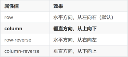
修改主轴方向
主轴默认在水平方向,侧轴默认在垂直方向
属性名:flex-direction
弹性伸缩比
作用:控制弹性盒子的主轴方向的尺寸。
属性名:flex
属性值:整数数字,表示占用父级剩余尺寸的份数。
弹性盒子换行
弹性盒子可以自动挤压或拉伸,默认情况下,所有弹性盒子都在一行显示。
属性名:flex-wrap
属性值
行内对齐方式
属性名:align-content
注意:该属性对单行弹性盒子模型无效。
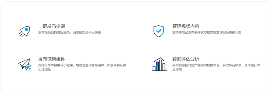
04-综合案例 – 抖音解决方案
整体布局
1
2
3
4
5
6
7
8
9
10
11
12
13
14
15
16
17
18
19
20
21
| <style>
* {
margin: 0;
padding: 0;
box-sizing: border-box;
}
li {
list-style: none;
}
.box {
margin: 50px auto;
width: 1200px;
height: 418px;
border: 1px solid #ddd;
border-radius: 10px;
}
</style>
<div class="box"></div>
|
列表布局
1
2
3
4
5
6
7
8
9
10
11
12
13
14
15
16
17
18
19
20
21
22
23
24
25
26
27
28
29
30
31
| <style>
.box ul {
display: flex;
flex-wrap: wrap;
justify-content: space-between;
align-content: space-between;
padding: 90px 40px 90px 60px;
height: 418px;
}
.box li {
display: flex;
width: 500px;
height: 88px;
}
</style>
<div class="box">
<ul>
<li>1</li>
<li>2</li>
<li>3</li>
<li>4</li>
</ul>
</div>
|
内容样式
1
2
3
4
5
6
7
8
9
10
11
12
13
14
15
16
17
18
19
20
21
22
23
24
25
26
27
28
29
30
31
32
33
34
35
36
37
38
39
40
41
42
43
44
45
46
47
48
49
50
51
52
53
54
55
56
| <style>
.box .pic {
margin-right: 15px;
}
.box .text h4 {
line-height: 40px;
font-size: 20px;
font-weight: 400;
color: #333;
}
.box .text p {
font-size: 14px;
color: #666;
}
</style>
<ul>
<li>
<div class="pic">
<img src="./images/1.svg" alt="">
</div>
<div class="text">
<h4>一键发布多端</h4>
<p>发布视频到抖音短视频、西瓜视频及今日头条</p>
</div>
</li>
<li>
<div class="pic">
<img src="./images/2.svg" alt="">
</div>
<div class="text">
<h4>管理视频内容</h4>
<p>支持修改已发布稿件状态和实时查询视频审核状态</p>
</div>
</li>
<li>
<div class="pic">
<img src="./images/3.svg" alt="">
</div>
<div class="text">
<h4>发布携带组件</h4>
<p>支持分享内容携带小程序、地理位置信息等组件,扩展内容及突出地域性</p>
</div>
</li>
<li>
<div class="pic">
<img src="./images/4.svg" alt="">
</div>
<div class="text">
<h4>数据评估分析</h4>
<p>获取视频在对应产品内的数据表现、获取抖音热点,及时进行表现评估</p>
</div>
</li>
</ul>
|

 微信
微信 支付宝
支付宝